Prickley Pears, Deserts, & Cider Labels
Released in May 2024, Desert Oasis marked the final run of the
2 Towns Ciderhouse Limited Release Series to be packaged in 500ml bottles. This release was particularly special for me, as it was my first limited-release label created for 2 Towns.
As the in-house artist for 2 Towns Ciderhouse, one of the most rewarding parts of my job is the collaborative process of crafting unique artwork for our labels. These labels, seen by thousands, play a crucial role in a product's success. While exciting, this process also involves valuable input and sign-off from many team members, highlighting the importance of our collective efforts.
Desert Oasis was the first label I designed that felt truly my own. Previous labels I worked on incorporated styles and elements from past artists, mostly updating existing designs to reflect new flavors. While contributing to these was rewarding (stay tuned for more on the Cosmic Explorer series), they weren’t fully mine. The limited-release line from 2 Towns differs from our other product lines, with each release being unique and the label art developed specifically for its flavor profile.
The creative process begins with a New Product Outline (NPO), which contains all the ingredient information, notes from the cidermakers, and other relevant details. Our copywriters also provide the product profile and descriptions. Armed with this information, I started brainstorming ideas and concepts. I put together several mood boards for Desert Oasis showcasing different art styles and possible names.
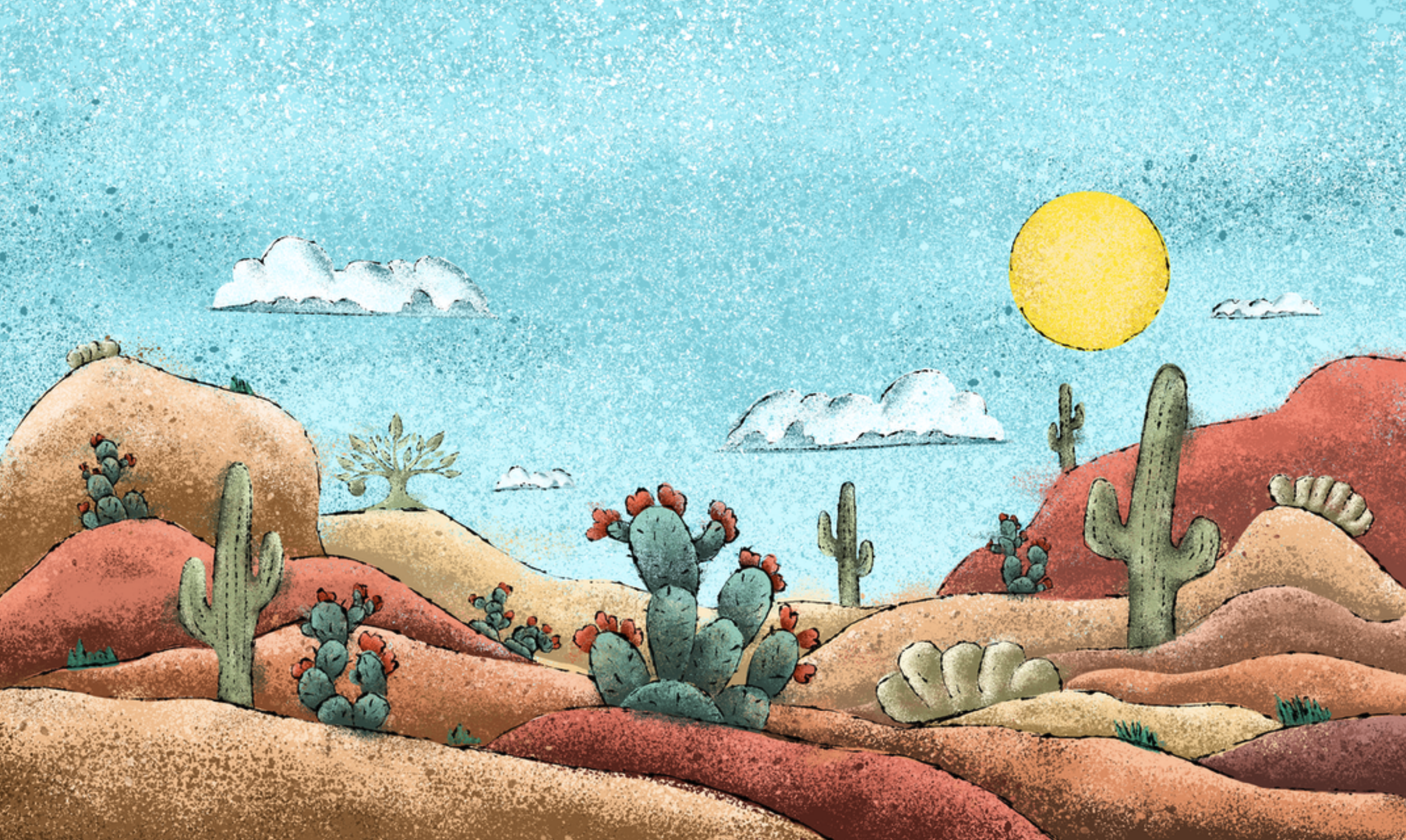
Initially, the product was named Citrus Oasis. However, based on feedback from our head cidermaker, we changed it to Desert Oasis to better reflect the main ingredients—Prickly Pear and Lime—without emphasizing citrus too much. With the style and name finalized, I began sketching. I created this label as a raster image rather than a vector. I set up my file at the standard label size but with a higher dpi to ensure flexibility for larger marketing materials. I wanted the label to capture classic desert scenes, so I started with the landscape, creating an inverted triangle layout to draw the eye to the center. I added various cacti and desert scrubs, with a larger prickly pear cactus as the focal point. I included smaller plants and a stylized 2 Towns apple tree logo as an Easter egg to add depth. The sky and clouds were layered to enhance the sense of depth, and of course, I included the sun, a constant in the desert.
After presenting the layout to stakeholders and receiving approval, I moved on to the actual illustration. Using the Mojave Desert for color reference, I blocked in the ground and plants. Although the initial mood board suggested a flat style, I felt it lacked the necessary impact. So, I opted for a more textured approach, using ink splatter and spray paint brushes to add dimension.
Adding texture and detail, I realized the illustration needed something to tie it together. I added thin, sketchy ink outlines to parts of the illustration, which brought everything into focus and gave the design more weight.
Once the illustration was complete, I added it to our label template, making minor adjustments to ensure legibility. Final approval felt incredibly gratifying, and I was thankful for the trust our team placed in me. When Desert Oasis was released a few months later, both the cider and the artwork received a positive reception. It was a great sendoff to the end of the 500ml bottle era for our limited-release line.


