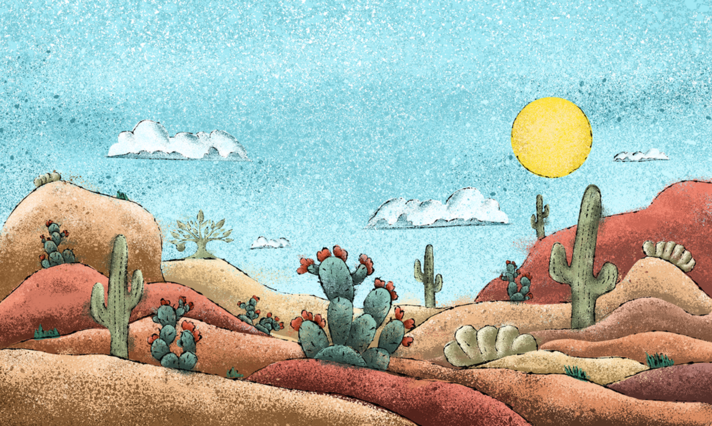
Desert Oasis Label Design
Overview
First released in 2024, Desert Oasis’s initial run was the last of the 2 Towns Ciderhouse Limited Release Series to be packaged in 500ml Bottles and was my first limited-release label for the brand.
SOLUTIONS
Challenges
The creative process begins with a New Product Outline (NPO), which contains all the ingredient information, notes from the cidermakers, and other relevant details. Our copywriters also provide the product profile and descriptions. Armed with this information, I started brainstorming ideas and concepts. I put together several mood boards for Desert Oasis showcasing different art styles and possible names.
Initially, the product was named Citrus Oasis. However, based on feedback from our head cidermaker, we changed it to Desert Oasis to better reflect the main ingredients—Prickly Pear and Lime—without emphasizing citrus too much. I wanted the label to capture classic desert scenes, so I started with the landscape, creating an inverted triangle layout to draw the eye to the center. I added various cacti and desert scrubs, with a larger prickly pear cactus as the focal point.
Process
Using the Mojave Desert for color reference, I blocked in the ground and plants. Although the initial mood board suggested a flat style, I felt it lacked the necessary impact. So, I opted for a more textured approach, using ink splatter and spray paint brushes to add dimension. Adding texture and detail, I realized the illustration needed something to tie it together. I added thin, sketchy ink outlines to parts of the illustration, which brought everything into focus and gave the design more weight.


I worked in Procreate on an iPad Pro with Apple Pencil to create the illustration. Once we had those dialed in I switched to Adobe Illustrator to work on the final label layout and elements.


